Showing posts with label Carlton Fisk. Show all posts

Monday, February 13, 2023

Go Red! 2019 Tops Stadium Club Red Foil Carlton Fisk

February is American Heart Month. As a nod to the Go Red for Women activities going on this month to help raise awareness, I thought I'd contribute several "red" themed posts sprinkled throughout the month. Here's the next one.


Let's talk about this card...


When Fisk left Boston as a 33 year old catcher, I wonder how many people would have guessed he had more than half his career left in front of him. That division of time makes it all the more remarkable that the Red Sox have managed to reclaim him as one of their own. Especially since his home run is no longer the best World Series moment in the last sixty years.

The card itself is really nice. As always, the red foil works well on the Red Sox card. Even with the pullover jerseys, it gives off a classic elegant feel that I enjoy. The image, too, seems to invoke the feel of so much motion for what is basically a posed shot. I can't really say much about it, other than to say I'm glad the text does a great job hiding to let the image speak for itself. Well done.

---

If you are able, I highly recommend you support the American Heart Association's efforts with a donation. You can find the link here.

Support the efforts to Go Red for Women!

Monday, January 10, 2022

2021 Topps Allen & Ginter Blaster!

It's time to open some more cards! This looks like my first blaster of 2021 Topps Allen & Ginter, so it was fun to do. I can't decide if I'm tiring of the A&G brand yet. The designs are getting pretty bland. I understand they're trying to fit in a specific style. But, that doesn't mean I can't be bored with it. While it's still fin to get cards of different people, and things, maybe the novelty has started to wear off. But, it's still fun to open packs.

How did this one turn out? Let's see!


Yup. The box. Even the box is boring.


As are the packs.


Inserts like this make me think that Topps is doing it right with their flagship sets where the inserts are just rehashing their old designs. It's not like "historical hits" is a particularly clever theme. Nor is the design an artistic masterpiece. If I want to include a card of Fisk in a set, might as well just slap a 1987 border on it. This one doesn't do much for me. Even if it's a card of "that" hit.


And here's the base design. Not much to get excited about. But, it does look nice for the old-time players like Williams.

And there you have it. Not a lot to write home about from this box. Os this set.

How did your blasters go?

Thursday, September 24, 2020

2020 Topps Heritage Blaster!

You may remember that the Easter Bunny was good to me this year, bringing plenty of card packs for me to open. This box represents the last one from that haul! I wanted to share it with you because, well, some of you might like it.

So here it is, a box of 2020 Topps Heritage!

I'm sure you've all seen plenty of this set by now. But, you can always skip over this. Right?

So...here are the highlights...


Starting with...the unopened box!


The hedge is back! Unfortunately, Workman won't be after he was recently dealt to the Phillies. Lots of memories.


I'll be honest, I din't realize Xander finished among the RBI leaders. I knew he had a bunch...but didn't register that it would be enough to make it on this card.


Speaking of RBI, this guy knows how to get them as well. With Xander, that's one heck of a left side of the infield. Hard to think of one better. Especially going forward.


Fisk Flashbacks are always fun. Especially when they flash back to something other than the 1975 World Series. As amazing as that series was...it's nice to remember that Fisk did other things in his career as well.

So, a solid if not spectacular box.

How did yours go?

Monday, January 27, 2020

1975 Topps Page by Page: Page 9 (73-81)

I'm sure that you all remember that I finally completed my 1975 Topps set. 

Now that it's done I thought it would be fun to look through the set and talk about it. Going page by page seemed like a good way to go about it. Hopefully you find it interesting to read what I have to say.

How about we continue with page 9?


Red Sox Cards on the Page:  1. And what a Red Sox card it is! A fabulous card of the hero of the 1975 World Series.

Cards that make the 1975 Topps set cool: Young Hall of Famers! Of course, you have Fisk from his Red Sox days as a young all-star. You also have Ted Simmons, a much more recent addition to the cool card ranks.

My favorite card on the page: Yeah. It's the Fisk. Really, it's everything that excited me about the set in the first place. A great design, including the all-star star in the corner. A Red Sox hero from before I was really old enough to know it. A participant in that great World Series, and a young card of a baseball legend. It's really fantastic.

What would your answers to those last two categories be?

Monday, September 23, 2019

2019 Topps Archives Blaster!

Yeah, I know. I should have posted this long ago. I'm sure you've all seen as much of the Archives product as you'd care to see at this point. You certainly don't want another post about someone opening a box.

Too bad. You're getting one.

After all, I have not given the definitive word on my experiences or opinions with the product. So, you'll have to just suffer through while I open this box.


Yup. There is is! Seven packs, plus coins!


 Yup. Just like they said.


So, the coins are cool and all. And I understand the vibe they're going for. But, I honestly have no idea what to do with these. Even the Red Sox ones. Are they display pieces? Am I supposed to put them in pages in a binder? Do I need to get coin collectors pages for them? Or, do they get tossed in a box? Help!


First pack in the box comes through in a big way with two Red Sox cards. For two players who didn't play their entire career in Boston, hard to imagine being more beloved than they are. World Series heroics will do that for you, I guess. I have to say that I like the '93 design more than I thought I would have. It's simple, and clean. A far cry from the bragging companies did (and still do) where their designs are intended to show off their computer graphics skills. Simple the name and some colored banners. So simple.


The 1975 Topps design is always a lot of fun. 


 The 1993 design again, with a great Yaz action shot. 


Nomar! Oh, wait. At least this one has a pretty border. Which is something you can only do if your card has borders.


This Chris Sale is a fun design as well, even if it's not exactly simply. But, for an all-star card, I think it needs to be flashy.


That pack illustrated a feeling that I had when opening the box. Lots of old players seemed to be popping up. And here in this pack there were three current players, and five retired players. Not sure if this was a goal of the Archives brand...to put old favorites in different designs, but it's a weird goal. Is the Rogers Hornsby PC community that strong? Did Jim Thome collectors have too easy of a time tracking down the 36 million of his cards produced during his playing days?  

This pic also shows one of my favorite things about Archives, the variety in the packs. I like flipping through different designs in my pack. The 90s were great for that with all their inserts. I like having that happen again.


Speaking of different designs, here's one of Eloy Jimenez.


The next Red Sox superstar, Rafael Devers, on the 1975 Topps design? Yes please.

So, overall a fun box to open. Lots of visual interest, and plenty of Red Sox stars from the past, present, and future! Not sure what else I could ask for.

How did your box go?

Thursday, March 8, 2018

Happy to Walk the Plank

About a month ago, I was one of the winners of a birthday contest at Bob Walk the Plank. Matt promised me that he was putting something special together to add something to my collection beyond a few new Pedro Martinez cards. When the package arrived, I was blown away with the contents, and his generosity. It has take me too long to chronicle the package with a post, but that's how long it took to adequately document everything!

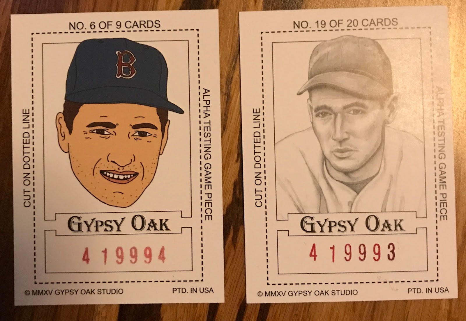
Matt chose to go in a completely different direction. The package I received was from Gypsy Oak (which was a bit confusing until I saw the "From Matt" written on the back). I was somewhat familiar with their art pieces from seeing them on other blogs and social media. But, nothing prepared me for what would come out of the envelope. Ready to check it out for yourself?

Let's see what's inside!


This is a fun label I could put on my very own beer, if I was the type of collector who actually used things like that. (My unopened jars of salsa would clearly say otherwise.) It's certainly unique, and I love the amount of detail that went into this item featuring XX.


According to the backs, these are a few studio created samples of the Gypsy Oak Baseball Art Cards. They're very similar to standard baseball cards in size and thickness. I love the different style on the Cy Young card. 


I can't find anything like these cards on the Gypsy Oak website. So, I'm not sure what they're called. The back isn't much help, with a paisley playing card type feel to it. But, I'm not going to complain about a great couple cards, especially the one of The Kid. (It's just now really bothering me that I didn't scan these in numerical order left to right.)


Here we have three cards calling themselves Helman Art Stamps. These cards are about the size of a T206, but much thinner stock, and have have perforated edges to really sell the "stamp" feel to them. I also love how the tobacco era design works with the player selection, especially Williams in his San Diego uniform. Imagine the outfield this trio would make with Ted in left, Speaker in center, and Hooper in right. Hall of Famers all of them.


More old time feel with these great cards. They call  themselves Colgan's Chips Base-Ball Pictures. They're again about the size of a T206, but approaching relic card thickness. This makes them very sturdy, and wonderfully attractive. Again the style, size, and player selection makes these cards feel like you stepped back in time. Smoky Joe Wood is a player who has too few cards, so it was great to see him included here. Hard to imagine many pitchers will have a season as good as his was in 1912.


As the front of this card clearly says, this is a wood engraving, and it shows. The picture doesn't do this card justice. Again, we're talking about relic card thickness, but all wood. The engraving is so well done, that I don't mind the guy on the right being included on a Red Sox card.


Here we have an uncut strip of micro cards. Each one is about the size of a quarter. It's a fun collection of Red Sox legends, ranging the century plus of Red Sox baseball from Cy Young to David Ortiz. Of course, I love the addition of the great Pedro Martinez!


Speaking of Pedro, Matt clearly knew of my affinity for the greatest pitcher to ever take the mound. The package included several great Pedro items, including these two cards. They're standard card size, but as thick as a relic card because, well, can't you see the relic? The Dodgers version has a 1992 penny in it. Of course, 1992 was the year Pedro made his Major League debut in Los Angeles. The Boston card has a 2004 penny in it. Pedro did something cool in 2004, you may remember.


Last, but certainly not least, we have these two 4x6 art prints of the one and only Pedro. I love how the two styles are completely different, but still capture the essence of Pedro. Incredible.

Clearly Matt went above and beyond with this prize package. I was thrilled to be able to add so many unique items to my Red Sox collection.

Thanks Matt!

Wednesday, January 17, 2018

36 Pack Wax Match: Pack 3

The Stage has been set. The Match is underway. Who will come out on top? There’s only one way to find out.

Keep going, and open that third pack!

As we dive into this pack, the 1990 set has taken the lead thanks to its pack two victory. Let's go!


Red Sox +2
1988 starts things off much better this time! Not only did it make it past the sticker, but it gets positive points! A great card too. If you're not going to have a collision picture, this is about as good as a catcher card gets. Full gear, trying to make a play. With the head extending into the border, it makes Gedman larger than life.


Yankees -2
And just like that, 1988 falls flat again. Back to even.


Hall of Famer +1
Look at this great card. I was tempted to give it two points for having two Hall of Famers. But, for one thing, Trammell isn't officially inducted yet. For another, the rules clearly say "Hall of Famer card" not "Hall of Famer on card" so, it's just one point even if Fernandez were in the Hall too.


Red Sox +2
One more big score for 1988. Another great catcher card. This would have been a pretty sweet pull for a Red Sox fan back in 1988, and it brings the 1988 pack total to +3. Can 1990 catch them?


Hall of Famer +1
It certainly jumps right out of the gate with another catcher. This one's a Red Sox Hall of Famer, but he's wearing the wrong color Sox on the card, so it's just the one point.


Yankees -2
It's one step forward, and two steps back. The Yankees card drops the pack into negative points.


Hall of Famer +1
And, back to even as the pack closes out with a Hall of Famer. Unfortunately, for 1990, this is where the scoring ends up.


The 1988 pack holds with its total of +3 to take the third pack match.

It also ties the  overall score two to one in this back and forth battle.

Box Bottom: 1988 +1 (1-0)
Pack 1: 1990 +6 (1-1)
Pack 2: 1990 +4 (2-1)
Pack 3: 1988 +3 (2-2)

What will happen next time?

What people are reading this week