I finally got my hands on one of these, so of course just had to open it and share.
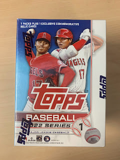
Here's what the box looks like.
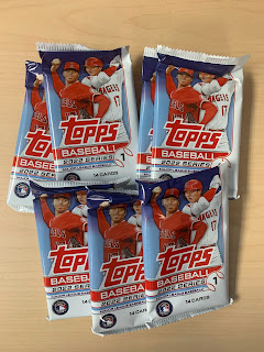
And the packs. I can't decide if I like the fact that the "patch" card isn't in its own pack anymore...or if I dislike it...or if I don't care.
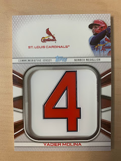
But here it is. I will say that I like the look of the card. Wonder if there's a number 36 out these somewhere.
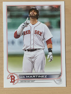
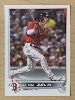
The first Red Sox card if 2022! What do I think of the design? I'm a fan. I like that we're sticking with the full borders. And even though the sweeping line design still has a "modern" feel, it seems less "computery" if that's a word. I love that I can read the player name again. I could use a touch more color...but overall I like it a lot.
Nice action shot of Duran here. Hope to see big things from him.
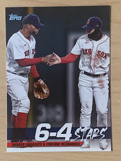
For all the people who complain about all the insert sets being recycled old designs...I'd take another 1952 style card over this.
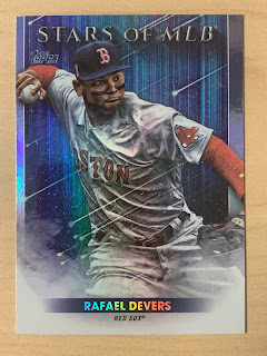
Or this. I mean, "Stars of MLB"? That's what people were longing for?
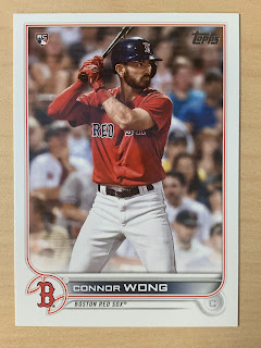
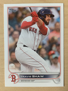
Another rookie card. I feel like the cropping is better this year. I don't feel like I'm standing too close to the player on this card.
Even this card of Mr. Shaw here. It's close, but not uncomfortably close.
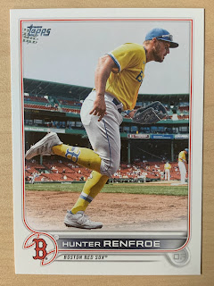
A fun, somewhat different, shot of Renfroe here. The yellow jersey is still overwhelming, especially with the added socks, but it's a nice picture. Looking in the background, looks like everyone else is already in position. Wonder why he's leaving the dugout so late.
So, there you have it. Not a bad collection of Sox cards., I think I'll enjoy collecting them this year.
How did your box go?



No comments:
Post a Comment