Showing posts with label Topps. Show all posts

Wednesday, February 23, 2022

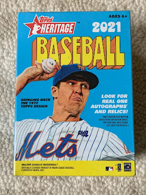
2021 Topps Heritage Blaster!

Looks like it's been a while since I've opened one of these. They're always a lot of fun. Do you enjoy these as well?

How'd I do?

Let's find out!


Here's the box, including the fun throwback design. I wonder how they came up with the "6+" age restriction. What about cardboard makes is inappropriate for kids under six? Are the wrappers choking hazards or something?


Here are all those choking hazards all spread out. Not exactly a ton of packs in this one. Or, any one I suppose. I do like the design, though.


And here's the card design we were all expecting. Everyone knows what the design looks like, and has for the last 50 years. We also already know what the Red Sox hedge looks like. I really need to figure out how to get there someday.

And that's it. An entire blaster, five whole packs, and one Red Sox cards. I know that's not exactly odds busting. But, it's a bummer anyway.

How did your blaster go?

Thursday, February 3, 2022

Project 70 David Ortiz

I haven't purchased many of the made-to-order cards from the Topps website. They're not something I chase, mostly because I'm not sure what they "are". As something printed and distributed the way they are, I'm not sure they're "cards" as opposed to "pictures" or "novelty items". So it's not something I've been chasing. I don't buy the Topps NOW cars unless they feature a game I attended or a really special event...like a championship. I was tempted by the Topps 2020 set last year. But, the 20 cards size of the Ted Williams set was too daunting. Especially if I wouldn't love every design. With the Project 70, I had the same feelings. But, decided that if they did any Pedro Martinez cards, I'd grab those. 

I bet you've figured out by now that I got more than those. I ended up grabbing a couple Ortiz cards as well. Since we've been celebrating Ortiz lately, I thought it might be fun to take a look at those today.

Here we go!


1954 David Ortiz by Distortedd. This is a fun card. I'll admit, though, that the only reason I got it was that I got the Pedro by Distortedd and thought the pair would go well together. I was right.


2013 David Ortiz by Naturel. I had to get this one too. Not only was this one of David Ortiz's most iconic moments with the Sox (my guess it this is what his statue looks like someday), but I was at this game. So, I do try and pick up related items when they're available. One day the SSP version of his standard 2013 Topps card will also be available. Judging by the low 810 print run, I might be the only person who feels this way.


This one's not a Project 70. Obviously, but it was a Topps website purchase this year. And, it illustrates the point that I try to pick these up when I can. There's nothing special about this card. It's a standard picture in an overused design. But, it was something I just needed to have.

What about you? Do you jump to purchase any of the cards from the Topps made to order section?


Thursday, October 1, 2020

2020 Topps Allen & Ginter Blaster!

It's time to open another blaster! Well, actually, it's time to tell you about another blaster I already opened! This time we'll go with 2020 Topps Allen & Ginter. These packs are always fun because they offer a lot of variety. How'd I do? Let's see!

Here are the highlights...


You know, this here is the box.


And the box has eight packs, that all look the same.


Right away, some of that variety I spoke of. It's not in every blaster that you can get a card of "The Swamp". I don't know if that's a bad thing.


More variety. This time a shot of a building. Eh.


Ooh, a rock! Not even "The Rock". Just, a rock. 


A former Red Sox! I can't decide how I feel when Topps puts old players with obscure teams. On the one hand, Rays fans might like to get another card of Boggs in their uniform. On the other hand...are there Rays fans? Sometimes it seems like Topps is showing off..."We know Boggs used to be a Ray and Sandberg used to be on the Phillies. Did you?"


A mini of a colossal. That's funny right there.


Another former Red Sox! This time pictured with a much more standard team.

And, that's it. No actual Red Sox. Weirdly, all the base cards I got were of real-life baseball players. That's not supposed to happen. So, no fun and no Red Sox. 

Not sure if it could have gone worse.

How did yours go?

Monday, March 16, 2020

A Fuji Holiday

A couple months ago now, Fuji wrote a post saying he was looking to complete the relic set from 2019 Topps Holiday. I can't say that I blame him. The Topps Holiday brand has turned into a fun set, and the relic design certainly expanded on that. So, while I didn't buy a ton of that product, I checked out his wantlist.

Luckily, not only did I have a card he needed, but it was a Yankees card! I always welcome the chance to get Yankees cards as far as possible from me. Fuji offered a card in exchange, and we were ready. 

Unfortunately, upon double checking, Fuji realized that he didn't actually need the card I have. Being a stand-up guy, though, he offered to send along the card he promised me anyway. Which card was it? I'm glad you asked.


See? I told you they were fun. I especially like how the game used piece is from a red jersey. Not only is it slightly rarer for the Sox to wear those jerseys, but it definitely fits the Holiday theme better. It's like a giant holly berry. (Come to think of it, with Pedroia doing nothing lately other than collect his albatross mistake of a contract, I wonder when he last wore a red jersey.)

I plan on sending Fuji back a return package anyway. Hopefully that won't violate his recent reduction in trade package mailings. After all, this would just even things up, right?

Thanks for the card Fuji!

Thursday, February 13, 2020

2020 Topps Series 1 Blaster!

It took me forever to find these on the shelves! And, then, it took me a couple days to finally post about it. I hope you think it was worth the wait as I look at my first blaster break of 2020!

And hoping you still care.


There's the outside of the box, so you know what you're looking for on the shelves.


Seven packs, and the extra special rookie card retrospective card pack! Let's start with that one...shall we?


Ok. I usually don't understand the point of these manufacture patch/relic/medallion things Topps does. But, I absolutely LOVE these. Or, at least I love this one. The thick card with the cut-out for the rookie card logo adds a great depth to the piece. And, it doesn't scream cheap and gaudy like a big coin or made up patch. Simple, elegant, and wonderful. 


The first Red Sox card of 2020! And he's still on the team! A Red Sox card in the first pack has to be a good sign, right? As for the card itself? I like the design. It's not as cluttered as I'd feared, or as others have said. The design is actually pretty simple, and tucked off to the side. It leaves a lot of room for the picture, which I always appreciate. Well done.


Two packs, two Red Sox cards! Another guy who is still on the team. I like how JD's arm fits perfectly into the little notch in the card's design


No Red Sox cards in the third pack, so I guess I'll use this one to show off the horizontal design. I like the horizontal even better since it tucks the design away even more. 


Back on the Red Sox bandwagon! This is showing off the Future Stars subset. It also shows how Topps keeps flipping the side of the card the border shows up on. It wasn't much of a big deal for this blaster. But, I could imagine it being annoying if I'm flipping through a big stack looking for a specific player that I want. 


No Red Sox cards, so let's check out the Turkey Red inserts. This design works well as a small insert set. The cards look too similar if you've got hundreds of them in a binder. But, a few sprinkled here and there can add some variety.


No Sox again, so here's a combo card of two Blue Jays future stars. These guys have a special place in my heart since I was able to see them play in AA (along with Vlad Jr) a couple times. Fun to see them advance as a group like that. I also enjoy these combo cards. Sure, they can be corny. But, cards are supposed to be fun...aren't they?


Speaking of Mr. Biggio, here's the foil version of his solo card. I could really take or leave the foil parallels. I'm split between not needing ANOTHER parallel to chase and liking the idea of having another different Xander Bogaerts card to try and collect.

So, that's what I got out my blaster. I was pretty pleased.

What did you get in yours?

Monday, December 16, 2019

Section 36 Photography Month: Baseball Card Photography

As we continue Photography Month here at Section 36, I wanted to cover a topic that gets me all twisted in knots when I think about it. 

Photography on baseball cards.

This is one of those topics where whenever I really consider it, I end up questioning the hobby itself, and my involvement in it. For instance, I hear lots of other people comment on the photography on baseball cards. They might think a picture is cropped too closely, or it's too dark, or it’s a boring pose. My first reaction to those is often, "who cares what the picture is like...it's just a card". Which then means, I'm collecting pictures of baseball players where I don't care about the picture?

Huh?

What I think it comes down to is that I'm considering cards almost to be ID cards. Photo on the front, player stats on the back. So, I'm not collecting the pictures as much as I am the package. The picture is just a way for me to visually identify the player discussed on the back.

It feels like Topps treats cards the same way. For their flagship set at least. In fact, the point is pretty well driven home by their creation of the Stadium Club set. This set was designed to showcase great pictures. Or “different” pictures. Or both. That would suggest that they don't expect the pictures to be the story on their flagship set. Just a way to ID the player.

Until, they don't. 

I could understand all the tightly cropped shots of pitchers pitching and hitters hitting if they didn't throw in a shot of JBJ in a full on dive to make a catch. That's not a way for me to recognize Bradley Jr. (Unless that's actually the best way to ID JBJ?) So whenever Topps tosses in a great action shot, it makes me wonder why all the other pictures are the same. Even though that's exactly what I want and expect. 

It's even tougher to justify when they use a terrible picture. One that doesn't really show the player at all. Maybe just his back while making a play. Or in a multi player shot. That's not the way to get me to recognize the player either.

So, I like the way Topps generally treats the sets. Closely cropped body shots for the flagship, and let Stadium Club have some fun and flex photographic muscle. It really does allow for the best of both worlds.

And helps me justify my hobby.

Tuesday, November 26, 2019

1975 Topps Page by Page: Page 3 (19-27)


I'm sure that you all remember that I finally completed my 1975 Topps set. It was a journey that had stalled for a while (as I'm sure many set builds do) after the initial burst and getting most of the cards. But, I was glad to finally put that final card in the binder.

Now that it's done I thought it would be fun to look through the set and talk about it. Going page by page seemed like a good way to go about it. Hopefully you find it interesting to read what I have to say.

How about we continue with page 3?


Red Sox Cards on the Page: 0. Another shutout. But, as I've mentioned, there are only so many pages that can have a Red Sox card, right?

Cards that make the 1975 Topps set cool: That top row is straight fire. Koosman, who I only really knew as "the other guy on Ryan's rookie card". The Munson is just a great card. And, i can't say enough about the Fingers card, but I'll try...

My favorite card on the page: Rollie Fingers. One of the things I love about the set as a whole is the younger cards of Hall of Famers. Once again, Fingers to me is that old guy with the funny moustache. But, here is is in that great golden uniform in the prime of his career. It's like traveling back in time, and I love it,


What would your answers to those last two categories be?

Thursday, November 21, 2019

1975 Topps Page by Page: Page 2 (10-18)


I'm sure that you all remember that I finally completed my 1975 Topps set. It was a journey that had stalled for a while (as I'm sure many set builds do) after the initial burst and getting most of the cards. But, I was glad to finally put that final card in the binder.

Now that it's done I thought it would be fun to look through the set and talk about it. Going page by page seemed like a good way to go about it. Hopefully you find it interesting to read what I have to say.

How about we continue with page 2?


Red Sox Cards on the Page: 0. Not shocking. There are only so many pages that can have a Red Sox card, right?

Cards that make the 1975 Topps set cool: There are a few that stick out. The Dave Concepcion is a guy I know from 1975 World Series highlights, so it's just to have one of his cards. Love the uniform on the Bill Melton too.

My favorite card on the page: The Frank Tanana is one that reaches the top for me. I don't remember Tanana other than his years as a grizzled vet. To see him as a youngster, sporting the fantastic rookie cup just make this card fantastic.

What would your answers to those last two categories be?

Monday, November 18, 2019

2019 Topps Series 2 Blaster!

OK, so it's not quite a Topps Update box. But, it's a little bit newer than some others. Been meaning to post this one for a bit, so glad I'm finally getting the chance.

And hoping you still care...if you ever did.


Yup. It's actually a Series 2 box. Couple decent ballplayers on the cover.


Seven pacs, plus the one special patch card pack. Let's start with that one.


OK. So, decent player. But, is there anyone out there with an Honus Wagner player collection that this sort of card would appeal to? Especially since, as you may have noticed, this isn't a regular old patch card. This is a special foil numbered version. So, an Honus Wagner super-collector? Let's check out the back of this one.


 Yeah. Ok. 36/150. Maybe I can think of someone who might like that numbering.


Starting with the real packs, we get another middle infielder without much range these days. I wonder what kind of offer the Sox could make him so that he would retire. Some sort of personal services contract in order to get him out of the luxury tax calculation? Nice picture though. I wonder when they could have gotten that shot.


High fives. Low fives. Number five. I sense a theme in this pack.


Bregman must be looking for his sign before he takes his cuts.


This card is much better than the annoying Aaron Judge versions. Almost makes it worth going to Wal-Mart. I said "almost".


I like the "Franchise Feats" idea for a card set celebrating 150 years of baseball. Gives a decent excuse to add more star players into the set. I, of course, live the Benintendi card. That picture belongs in ever sports room in New England.


Not sure I need another Bob Feller reprint card. Let me rephrase that. I know I don't.


Nor do I particularly need a Rickey Henderson reprint/throwback. It's one thing to see new players on old designs. It's another to see them on designs we've already seen them on. Not sure I see the purpose. 

But, overall, a couple decent Red Sox cards in the box...including an insert. Not exactly something to write home about. But, it's not like it's a premium box. 

How did your boxes go?

Wednesday, October 30, 2019

2019 Topps Allen & Ginter Blaster!

Yup. You were probably hoping there would be a Topps Update blaster coming soon. Hopefully there will be. As soon as I get get my meaty little claws on one, you can be sure. But, for now this was still hanging around my Target. So, since I haven't opened one on here yet, I thought it would be fun. 


How did it go? Only one way to find out...keep reading!


Yup. They use that enormous box to hold eight packs. Have we figured out why they do that yet? This of the packaging and shipping costs they could save. Let alone saving the turtles.


First pack, and first TWO Red Sox. Pretty solid talent represented by these two as well. I like the design of the set this year. It manages to get the feel of that old timey paintings, but still make the images easy to see.


Two packs, both with Red Sox cards! Always enjoy getting cards of this World Series hero. Is the look on his face him knowing that he holds all the cards?


Not a Red Sox card, but still a solid pull! Odd that Alonso's cards don't seem as popular as Judge's were just a couple years ago, despite Alonso breaking Judge's record and also playing in NY. The interlocking N-Y sure does have a lot of pull!


Always fun to get a Hall of Famer. Even thought thy mystique is wearing off a little bit since they seem to be included by the handful in just about every set these days.


Speaking of Judge...


Look, another Hall of Famer. He's in the Hall of Fame, right? I lost track once they started voting everyone in the world into the Hall.


Not a Hall of Famer. I always see these cards and question my involvement in the hobby. My first reaction is, "no matter how much I think monkey's are cool...why would I collect a card just because it has a picture of a monkey on it?" Then I remember, that's what the entire baseball card hobby is based on. Why are collecting cards with baseball players on them more legitimate that collecting cards with monkeys on them? Any ideas?


Or, you know, thrones on them?

So, there you have it. Solid box if I do say so. Lots of Red Sox, a few Hall of Famers, a hot rookie, and some fun oddities. Pretty much exactly what you hope to get in an A&G blaster.

What did you get in yours?

What people are reading this week